
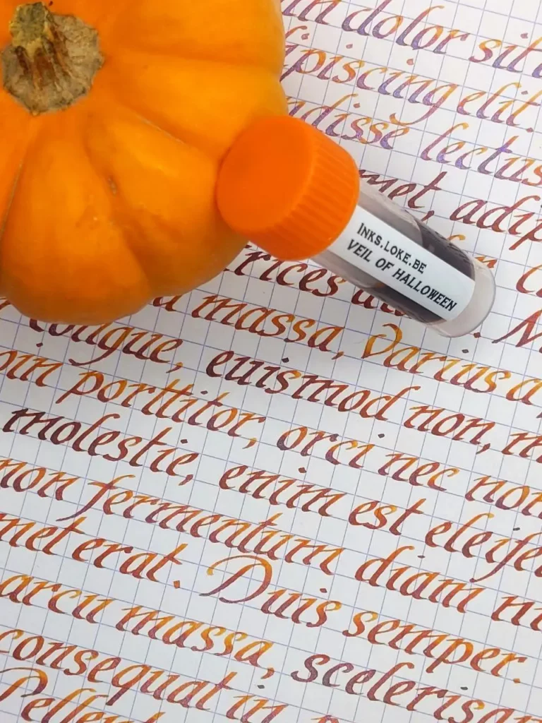
[ALL HALLOWS’ DAY SPECIAL] It is this time of the year, when the witches go riding and black cats are roaming the surface of the Earth, announcing that the veil between the world of the un-dead and ours is wearing thin… It is also the time for a dedicated ink. An orange ink for Halloween, bringing a purple veil to our writings!
Shading and Shimmer
The base for this Halloween ink was inspired by an ink made by Noodler’s : Apache Sunset. I found that ink really nice, with lots of shading and presenting a good behaviour on most papers. The only drawback to me was a slightly “too light” colour that was sometimes difficult to read. The idea was to work on a similar base, however more rich and more orange-ish, of course! As the name “Veil of Halloween” was growing stronger in my mind for this ink, a purple mica was added to the ink to give a slight touch of the supernatural.
Formulation work started with several dyes to provide a solid base for this Halloween Ink.
You can see on the images below the first attempts to prepare the base colour and the “reference” ink by Noodler’s on the left of the first image. The second image shows some preliminary writings using the same base and a medium sized nib.
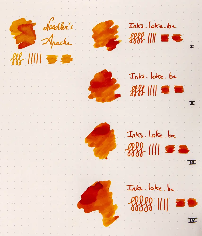

After some feedbacks from inks lovers here and there, I decided to settle the base for this ink according to sample I (vial 4). Not only the formulation only used 1 dye but this was the one showing the most shading potential in these early tests. The formulation in vial 6 coming close after as shown in the next image.
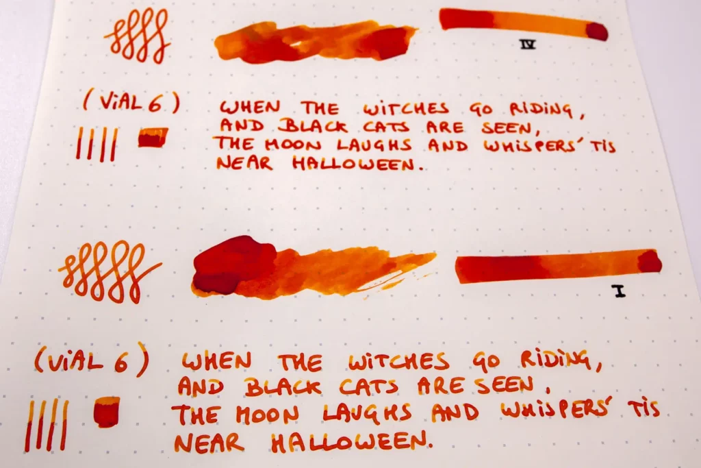
We could have left it there but this ink was not intended to be an ordinary ink but rather something a bit special that could fit Halloween’s mood. A very fine purple mica was therefore subsequently added to the formulation in the hope of giving that extra-touch wanted for Halloween… That Veil of Halloween!
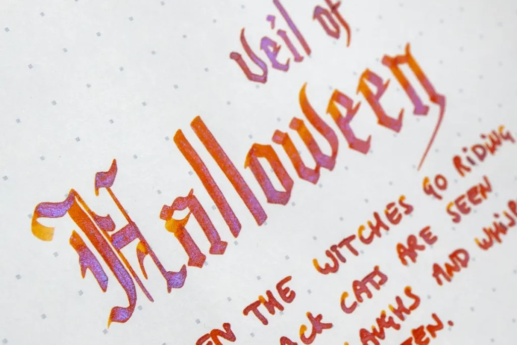
Writing samples
Below are presented a few samples written with a stub nib 1.0mm on Iroful paper:
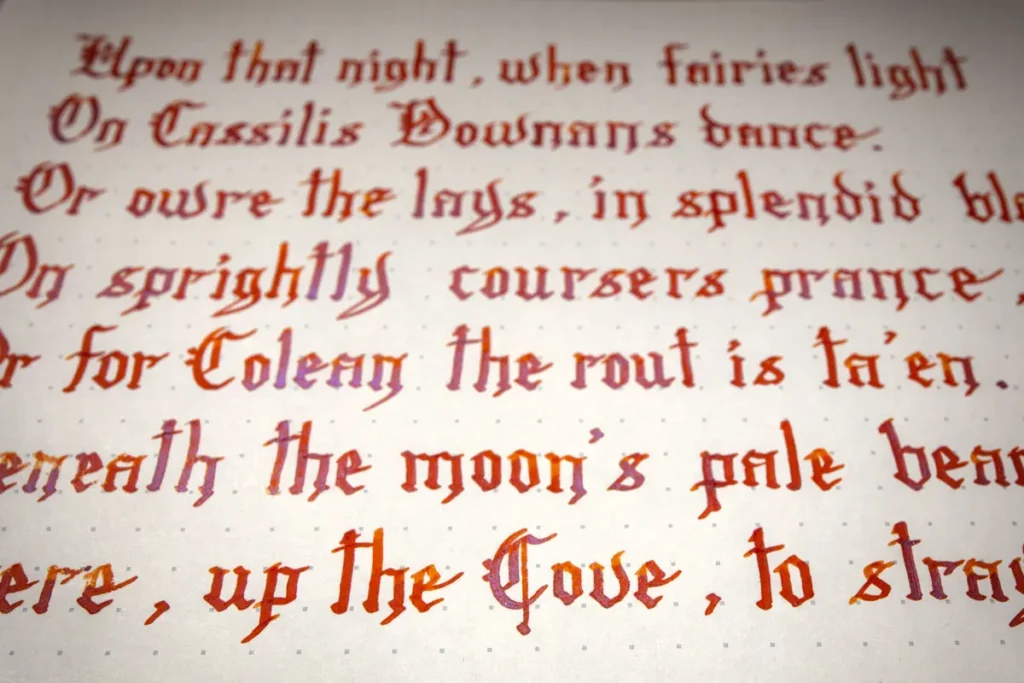
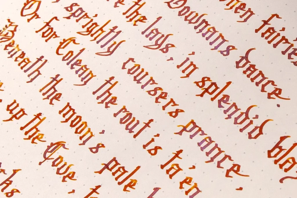
Now really comes the best part. An ink is not much without beautifully-layed words or a precise drawing to express all of its contents. For this section, I would like to thank Marie-Claire Redon for the next images and for the time spent testing the inks! Please have a look at her folio here, there are many great illustrations to enjoy. In the meantime, you can find beautiful writings to showcase this Halloween ink 2022 just below!

Hope you enjoyed watching this Halloween Special!
Reader notes