-For this new Inksperimentation I would first like to wish you all a marvelous and wonderful New Year. All the best for 2023! That being said, back to inks now and this new experimentation, namely British (R) Green!
Context
I take most of my notes using either black (Aurora) or blue (Science Blue) and it was time to try something new that could be used as a daily writer and having a bit of colour while staying on the professional side. Green seemed like a good choice for this project – moreover it should provide a “classy” touch to the end result. To sum up the objectives:
- Suitable for work / professional documents;
- Reasonable drying time;
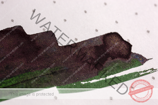
- Very little sheen (if any);
- On the darker side (green-black);
- On the wet side;
- Neutral pH (or very close).
Having never worked specifically with green hues before, the first attempts were relatively off-target and several formulations were required to obtain a colour that was close to the objective.


After some feedbacks from inks lovers here and there, I decided to settle the base for this ink according to a colour in between the British Racing Green and the regular British Green. That colour can be seen on the image below (vial G – pure chance!) with the description of the origin of the colour British Racing Green (written with a Lamy nib M-size):

British (R) Green
The new British (Racing) Green ink was born and now was the time to scale up the production to the first 20mL that would be used for the first serious tests and writing samples. Scale-up was made according to the original formulation without any particular issue. Interesting to note, this is my first phenol-free formulation as a “greener” preservative was used here. I have to admit that somehow I miss that lovely phenolic odour… The sample preservation and lifetime will therefore be an important parameter to monitor for this sample as well. At this day of writing, the ink is now 2 months old and so far so good!
Writing samples
Below are presented a few samples written with a medium nib in a Tomoe River notebook. More than 50 pages written and the ink behaves as expected but for a flow that seems to be on the neutral side – not dry but not extra-wet either, overall a good match for note taking with correct drying times as a positive consequence.


I would like to thank Marie-Claire Redon again for her participation in the very first stage of the creation of this ink and for the following images! I kindly remind you to take the time and have a look at her folio here, there are many great illustrations to enjoy. In the meantime, you can find beautiful writings to showcase this British (R) Green just below!


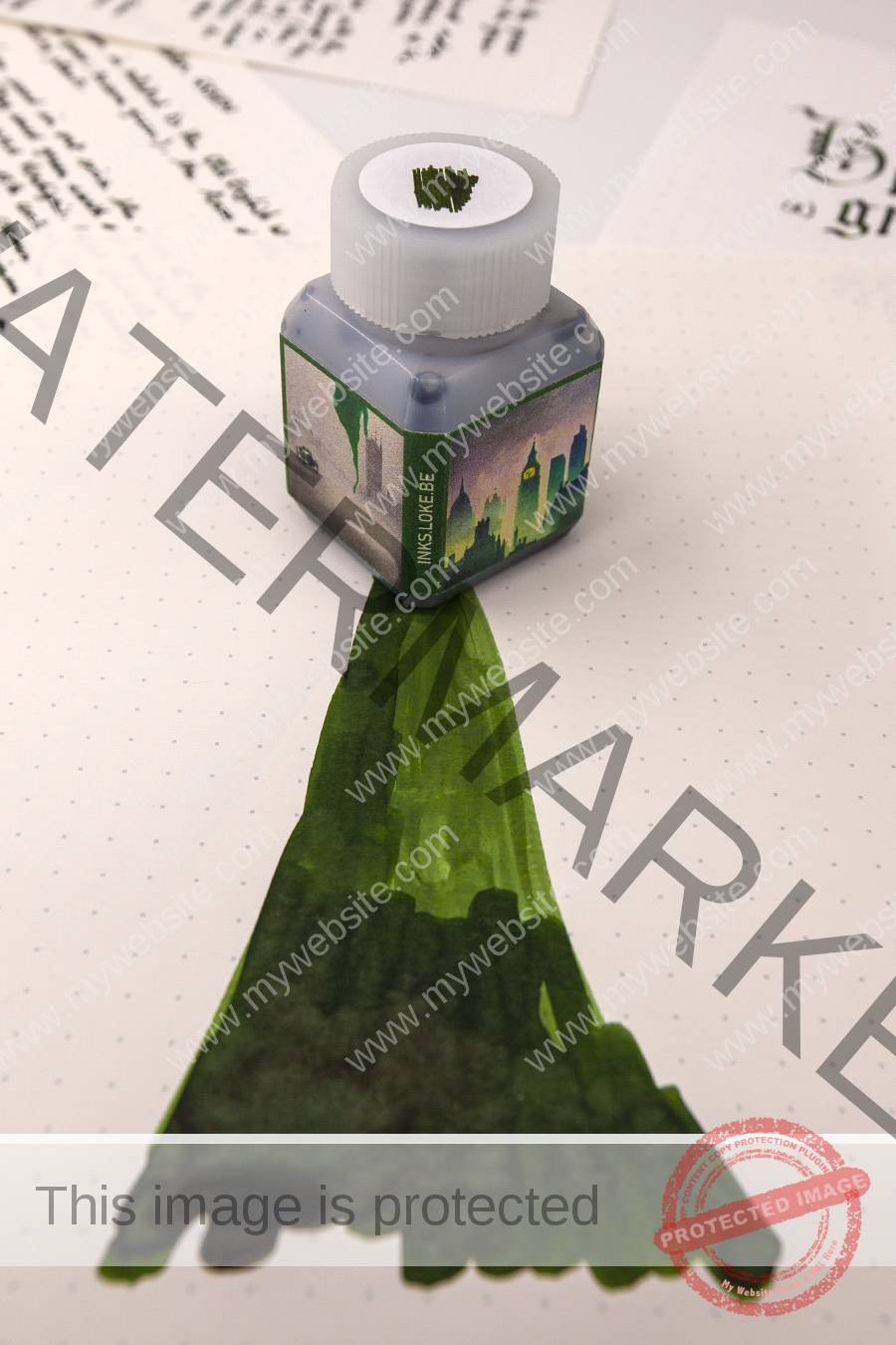
Below is presented the artwork that is printed on the sample bottle of 20mL. The previous 3-faces format was selected at this stage as it suits the 20mL plastic vials very well, having the names written on the borders of the bottle.


Hope you enjoyed watching this new Inksperimentation, please feel free to comment below ![]()
Stationery used in this post:
Paper(s):
– Loose sheets of Iroful paper [A5 | 75gsm]
– Loose sheets of Tomoe River paper [A4 | 52gsm]
– Oxford Optik paper pad [A5 | 80gsm]

An outstanding ink, bringing to mind youthful dreams, lusting after MG Midgets and Morgan Plus 4s.
I am gobsmacked. This is fantastic. Staring discontentedly at my two bottles of green ink…
Thank you for the kind comments!
Loke, this is a fabulous-looking ink, and believe me, I adore green inks!
I can proudly say that I have 144 bottles of different green inks in my collection.
Are you planning on marketing this wonderful ink in the near future?